Jetpack Compose and Composable Preview
Make the most out of the preview screen during iterative development
With the new Android Studio Electric Eel, the support for composable previews got new features like the definition of Android device size, multiple previews with the class definition, sample data sources and more.
Composable Previews give you the option to see the actual state of your composables without an emulator. So, the developer can iterate faster with various settings and get to the final desired composable view.
Basic usage
If a new composable is created in Android studio, the second function with a tag @Preview is generated underneath, which serves as a starting point for your previews. The following screen is used as an example of how to create better previews.
@Composable
fun WelcomeScreen(navController: NavController) {
    Column(
        modifier = Modifier.fillMaxSize(),
        verticalArrangement = Arrangement.Center,
        horizontalAlignment = Alignment.CenterHorizontally
    ) {
        Spacer(modifier = Modifier.weight(0.2f))
        Image(
            painter = painterResource(id = R.drawable.bluetooth_icon),
            contentDescription = stringResource(id = R.string.welcome_image_description),
            contentScale = ContentScale.Fit,
        )
        Spacer(modifier = Modifier.weight(0.3f))
        Text(
            stringResource(id = R.string.welcome_title),
            fontWeight = FontWeight.Bold,
            fontSize = 45.sp,
            modifier = Modifier.padding(8.dp)
        )
        Text(
            stringResource(id = R.string.welcome_text),
            fontWeight = FontWeight.Normal,
            fontSize = 18.sp
        )
        Spacer(modifier = Modifier.weight(0.1f))
        Button(onClick = {
            navController.navigate(IntroNav.INTRO_MOTIVATION_SCREEN)
        }) {
            Text(
                stringResource(id = R.string.welcome_button),
                fontSize = 18.sp,
                fontWeight = FontWeight.Bold,
                modifier = Modifier.padding(12.dp)
            )
        }
        Spacer(modifier = Modifier.weight(0.2f))
    }
}
If needed parameters are added to our composable, we will get the following result. If the preview is missing in your composable file, start to write prev and a hint from Android Studio appears. By clicking enter, the Android Studio will generate all the needed code.
@Preview
@Composable
fun WelcomeScreenPreview() {
    AppTheme {
        val navController = rememberNavController()
        WelcomeScreen(navController = navController)
    }
}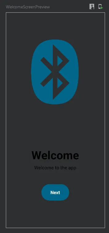
Default preview of composable
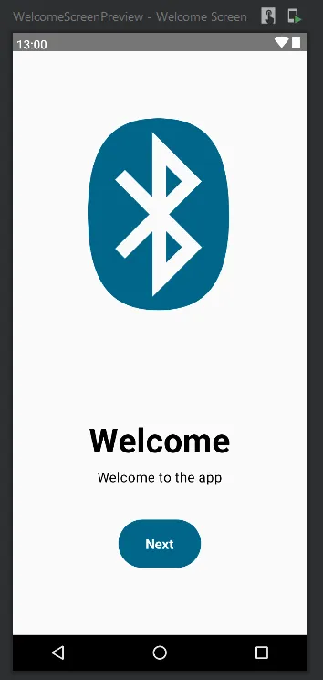
To make it look much more realistic, we can add a couple of parameters to the @Preview.
showBackground— the background of the device is filled by default colour or bycolorBackgroundparameterbackgroundColor— is 32bit ARGB colour in Long. You need to multiply the hex colour representation to a Long number manually because the number needs to be compiler constant.showSystemUi— shows the bottom navigation top bar with the timename— shows the custom name for the previewapiLevel— which target Android version should be usedfontScale— the scaling of the font based on the settings of the phonelocale— to change the used locale by the viewuiMode— can change UI colour masking in accordance to choice (e.g. to dark mode)
@Preview(
    showBackground = true,
    backgroundColor = 256 * 256 * 256, // R * G * B
    showSystemUi = true,
    name = "Welcome Screen",
    fontScale = 1f,
    local = "en"
    apiLevel = Build.VERSION_CODES.TIRAMISU,
    uiMode = Configuration.UI_MODE_TYPE_NORMAL
)
To avoid integrating background, put into your compose tree the
Surface,Scaffoldor other composable with background and it will create the background for you.
Sizing of the Preview
@Preview implements the sizing of the screen. The screen can be previewed at multiple screen sizes at once. You can choose predefined devices or your width and height too. Writing id or spec inside of the string will show hints.
// for defining the specific device - names are checked by IDE
@Preview(device = "id:pixel_5")
// for defining the screen specifications - values are checked by IDE too
@Preview(device = "spec:width=411dp,height=891dp,dpi=410,orientation=portrait")
Reusing Preview Settings
Preview tags can be aggregated into one class and repurposed for any other view. Creating multiple previews for one composable is not needed anymore. To create multiple screen configurations, the annotation class needs to be defined:
@Preview(device = "id:pixel_5")
@Preview(device = "id:pixel") // you can add any number of previews together
annotation class MultipleScreenSizePreview

@MultipleScreenSizePreview
@Composable
fun WelcomeScreenPreview() {
    AppTheme {
        Surface {
            val navController = rememberNavController()
            WelcomeScreen(navController = navController)
        }
    }
}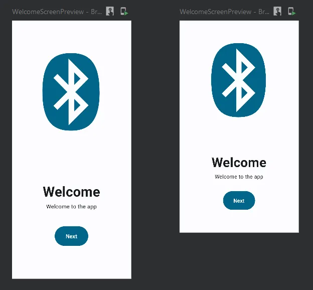
Multiple screen preview
Fell free to mix different devices and screen size specifications.
You can mix your custom classes too!
// set of bright screens
@Preview(device = "id:pixel_5")
@Preview(device = "id:pixel")
annotation class BrightScreens

// set of dark screens
@Preview(device = "id:pixel_5", uiMode = Configuration.UI_MODE_NIGHT_YES)
@Preview(device = "id:pixel", uiMode = Configuration.UI_MODE_NIGHT_YES)
annotation class DarkScreens

// combination of previews
@BrightScreens
@DarkScreens
@Composable
fun WelcomeScreenPreview() {
    AppTheme {
        Surface {
            val navController = rememberNavController()
            WelcomeScreen(navController = navController)
        }
    }
}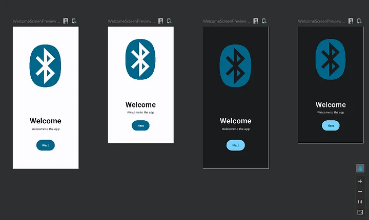
Combined previews of dark and bright screens of the same composable
Adding sample data to preview
The composables need some data to show or state to show. In most cases, it is enough to pass one or two parameters manually. However, if there are many states or big data to pass, the code gets stuffed with all the inputs.
The preview enables us to create a data provider where the data can be separated, loaded and passed to the preview.
Here is an example of the screen, which can go among loading, success and error states.
@Composable
fun MainScreen(state: MainState) {
    Surface {
        Column(
            modifier = Modifier.fillMaxSize(),
            verticalArrangement = Arrangement.Center,
            horizontalAlignment = Alignment.CenterHorizontally
        ) {
            when (state) {
                MainState.ErrorState -> Column(horizontalAlignment = Alignment.CenterHorizontally) {
                    Image(
                        painter = painterResource(id = R.drawable.baseline_error_24),
                        contentDescription = "Error state",
                    )
                    Text(
                        text = "Error occurred during loading",
                        textAlign = TextAlign.Center,
                        fontSize = 36.sp
                    )
                }

                MainState.LoadingState ->
                    Column {
                        CircularProgressIndicator()
                        Text(text = "Loading", fontSize = 36.sp)
                    }
                MainState.SuccessState -> Column(horizontalAlignment = Alignment.CenterHorizontally) {
                    Image(
                        painter = painterResource(id = R.drawable.baseline_check_24),
                        contentDescription = "Success state"
                    )
                    Text("Success", fontSize = 36.sp, textAlign = TextAlign.Center)
                }
            }
        }
    }
Here are the available states:
sealed class MainState {
    object LoadingState : MainState()
    object SuccessState : MainState()
    object ErrorState : MainState()
}
To create PreviewParameterProvider<T>, the provider needs to implement this interface and define the data class. Here comes the convenience of sealed classes.
class MainStateProvider : PreviewParameterProvider<MainState> {
    override val values = sequenceOf(
        MainState.LoadingState,
        MainState.SuccessState,
        MainState.ErrorState,
    )
}
The Values field is overridden and gives us the place to put our custom data. For every entry, the provider will create a new Preview. The input parameter is annotated with our provider @PreviewParameter(MainStateProvider::class) and the compiler will take care of the rest.
@Preview(device = "id:pixel_5")
@Composable
fun MainScreenPrev(@PreviewParameter(MainStateProvider::class) state: MainState) {
    MainScreen(state)
}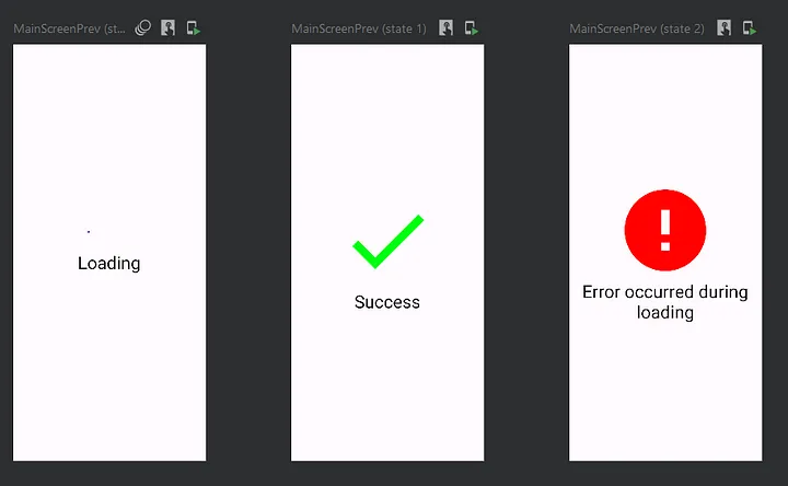
Three different states defined through PreviewParameterProvider
The usage is not limited to states. Explore other approaches to preview the screen with various input data and only one provider.
Final Thoughts
- Previews enable you to quickly see changes, and iterate and compare views without launching the emulator.
- Creation of previews will force you to keep separate logic and UI because it will consume less time.
- To get instant feedback across multiple device configurations in one grid.
- Previews can create images by right-clicking on them. The images can be shared with other developers or managers for quick feedback.
- Unfortunately, previews are not replacements for UI testing and end-to-end testing.
- Keep it simple!
Thanks for reading!